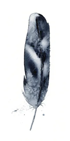
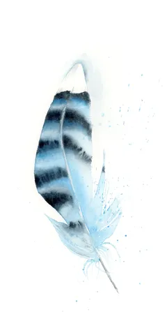
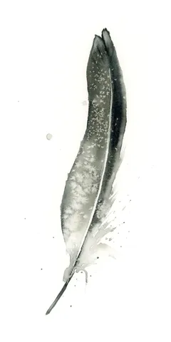
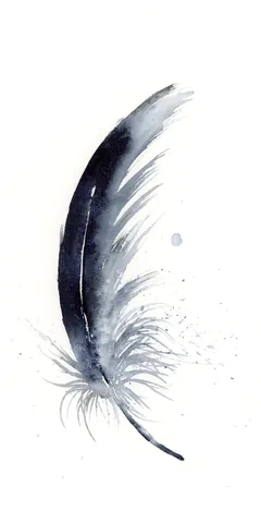
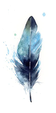
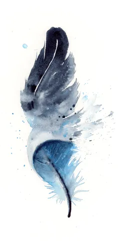
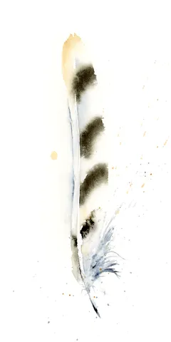
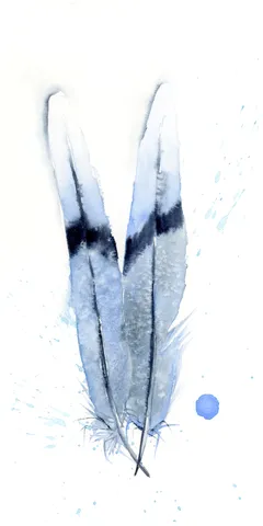
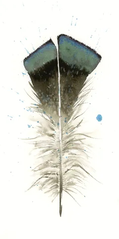
I chose a serene palette of blues and soft grays to capture the gentle essence of this feather. With each brushstroke, I layered the colors delicately, allowing the coolness to… more→
Palette:
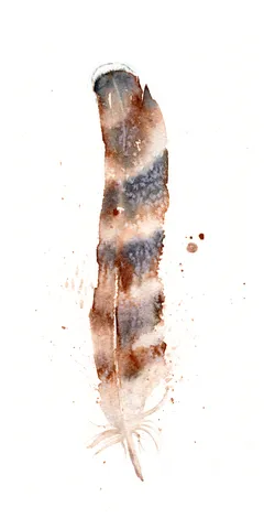
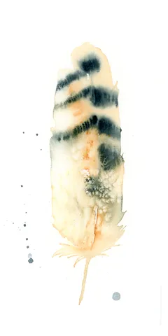
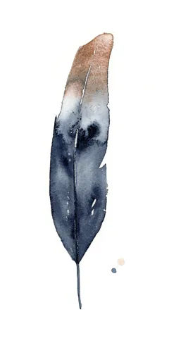
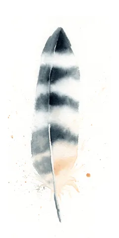
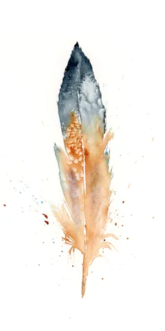
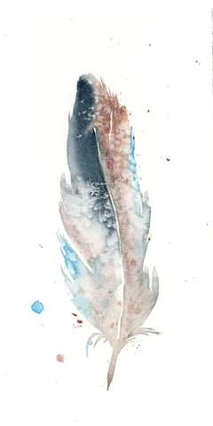
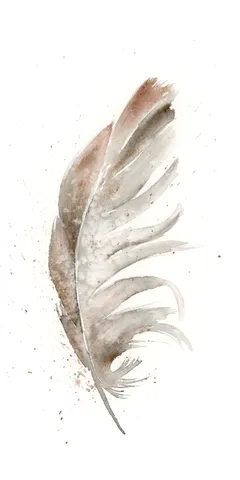
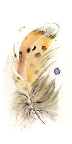
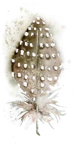
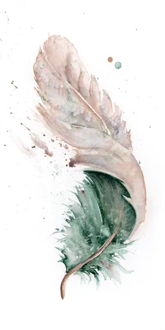
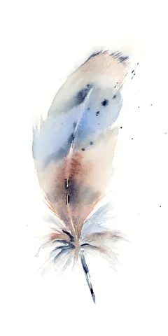
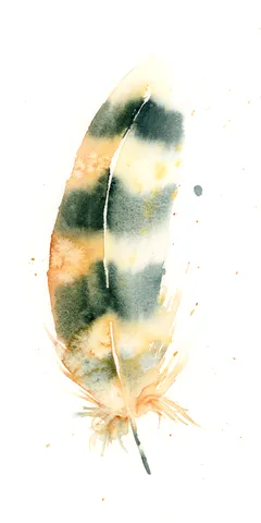
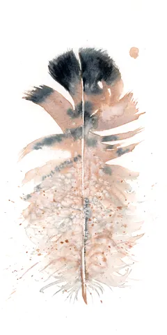
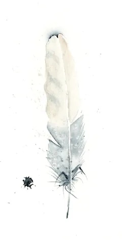
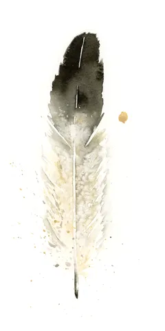
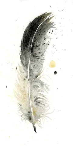
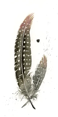
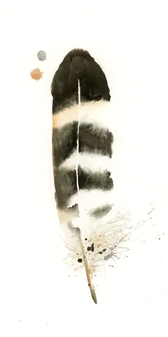
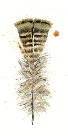
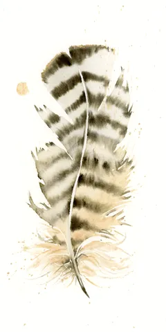
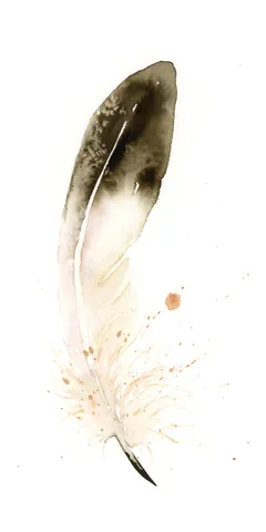
In this piece, I embraced the gentle flow of watercolors, using soft beiges and grays with hints of orange to create a serene and natural feel. I focused on subtle… more→
Palette:
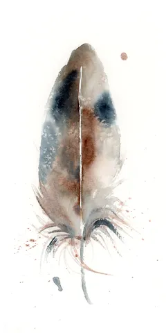
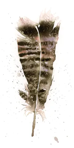
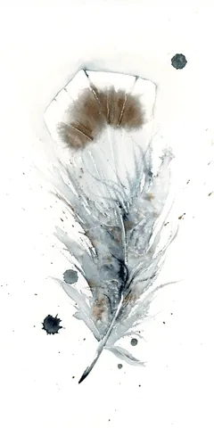
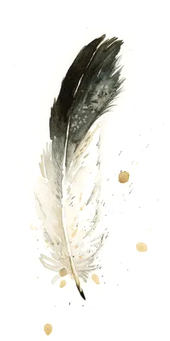
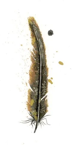
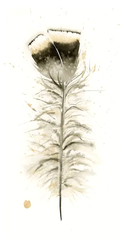
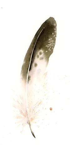
I chose a gentle palette of earthy browns and soft grays, blending them together to create fluid transitions and a sense of warmth. With deliberate brushstrokes and careful layering, I… more→
Palette:
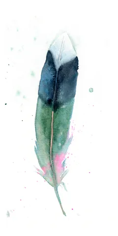
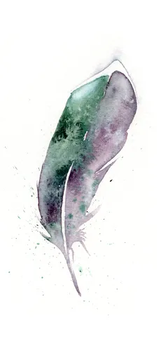
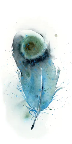
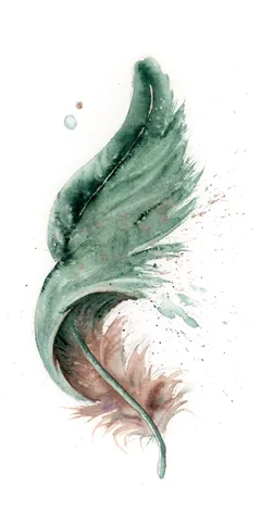
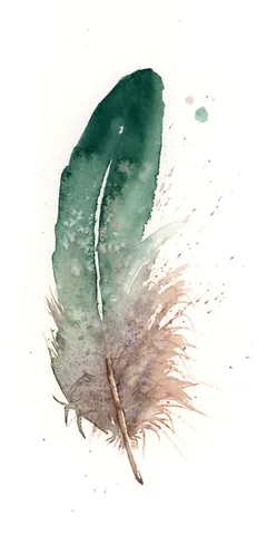
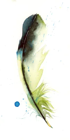
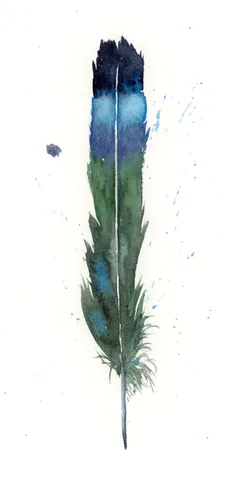
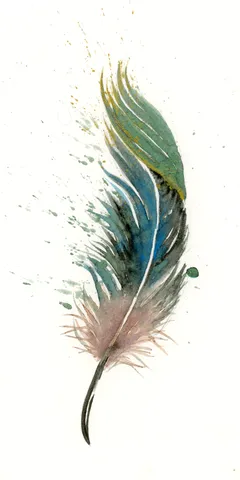
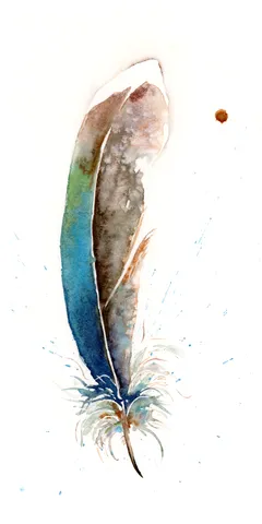
In this piece, I chose soft greens and purples, letting them blend gently into each other, creating a serene yet dynamic flow. The feather’s delicate edges and subtle splatters hint… more→
Palette:
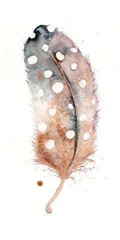
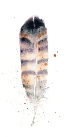
I chose a gentle, earthy palette, infused with my hand-made Moab Pigment #1, to create this delicate feather. By layering soft purples and rusty browns, I allowed the colors to… more→
Palette:
I crafted this piece using the rich, earthy tones of my hand-made Moab Pigment #1, letting the gentle washes of soft gray transition into warm beige, capturing the delicate essence… more→
Palette:
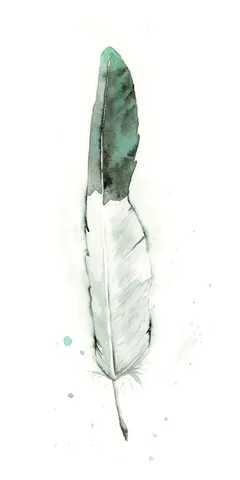
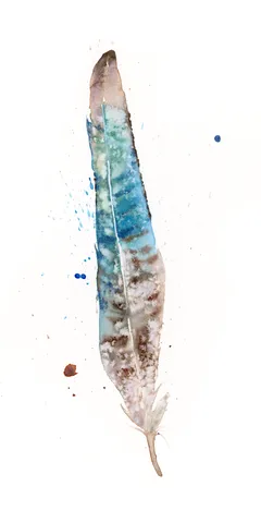
In creating this piece, I embraced soft shades of teal and gray, allowing the colors to flow and blend subtly on the canvas like a whispered story. The delicate transitions… more→
Palette:
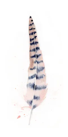
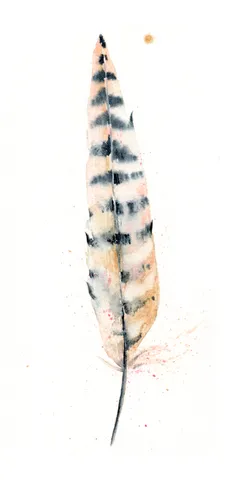
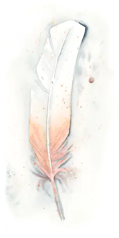
In this piece, I infused gentle pastels and earthy tones, letting soft pinks and subtle grays dance across the canvas to create a warm, inviting atmosphere. The delicate transitions and… more→
Palette:
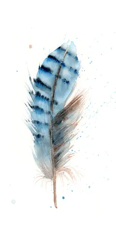
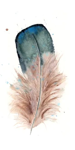
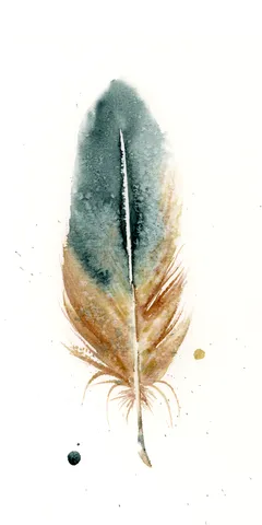
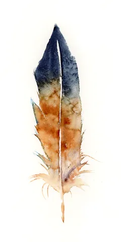
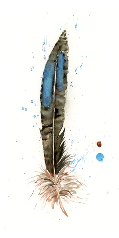
In this painting, I gently let the deep blues and warm rust tones flow together, using soft transitions and delicate layers to capture the feather's delicate nature. I applied watercolors… more→
Palette:
In this piece, I gently guided soft blues and earthy browns to create a feather that feels both delicate and grounded. The colors are layered with light brushstrokes that allow… more→
Palette:
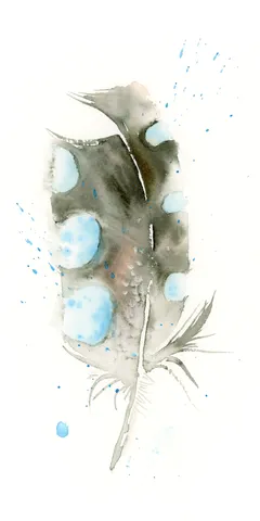
In this piece, I embraced a gentle palette of soft blues and warm browns to create a sense of calm and connection. I allowed the colors to blend and bleed… more→
Palette:
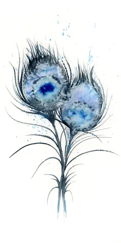
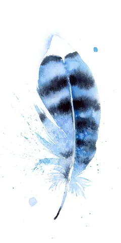
In this painting, I chose soothing blues and greens that blend seamlessly, transitioning like the turning of a new chapter. My brushstrokes are both delicate and purposeful, capturing gentle splatters… more→
Palette:
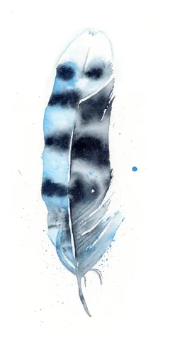
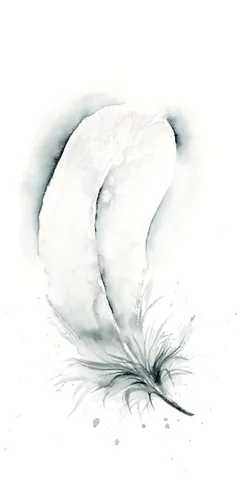
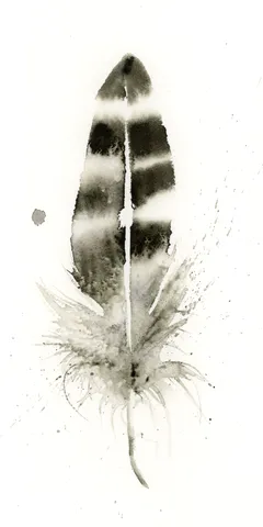
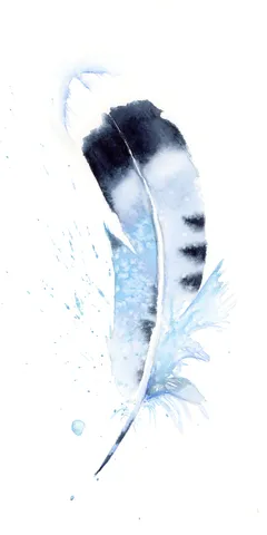
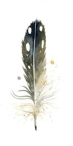
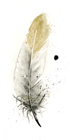
I'm drawn to the soothing transition of soft grays and whites in this painting, where the gentle curves of the feather contrast with the delicate splatters and drips that suggest… more→
Palette:
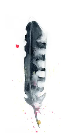
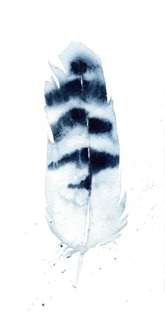
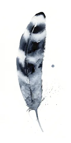
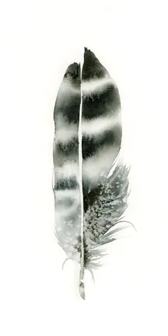
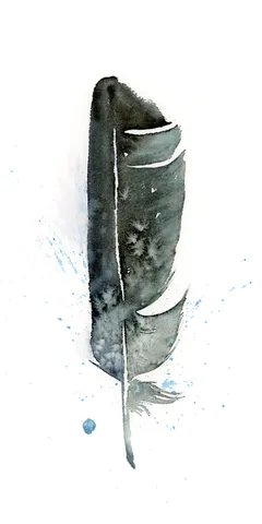
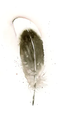
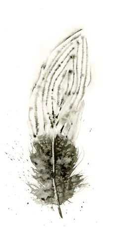
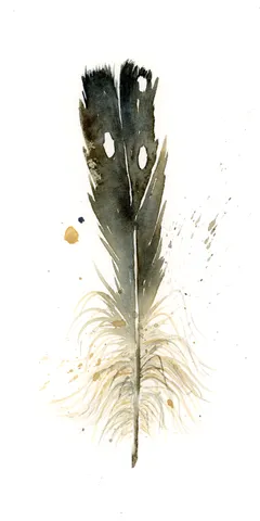
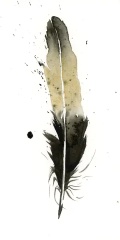
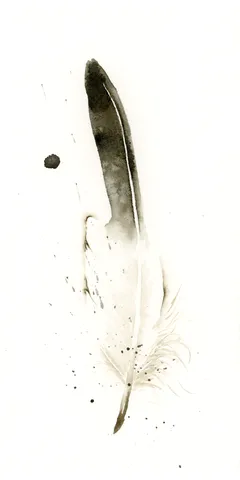
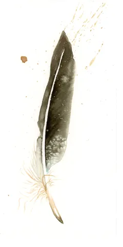
In this painting, I embraced the subtle beauty of grayscale, using soft transitions from light to dark to capture the delicate nature of the feather. I let the ink flow… more→
Palette:
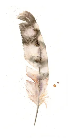
In this piece, I used soft, earthy tones of brown and gray to give the feather a delicate, ethereal quality. The gentle transitions and subtle layering create a sense of… more→
Palette:
I chose soft, earthy tones, like gentle browns and deep blues, to create this feather, letting them blend gracefully. With each brushstroke, I aimed for subtle transitions, allowing the colors… more→
Palette:
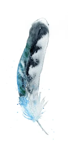
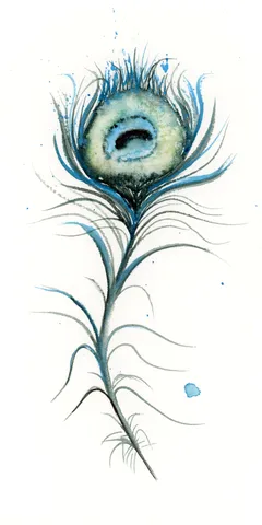
I used soft blues and greens to create this feather, allowing each color to gently blend into the other with smooth transitions that evoke a sense of tranquility. The delicate… more→
Palette:
In creating this piece, I carefully chose a palette infused with the earthiness of my handmade pigment, Rocky Mountain #7. The gentle transition of blues, browns, and soft greens, thoughtfully… more→
Palette:
I chose a soft palette featuring hand-made pigment Rocky Mountain #7 to capture the gentle elegance of this feather. The blending of tranquil blues and earthy browns creates a comforting… more→
Palette:
In this painting, I used a custom palette featuring my handmade pigment, Rocky Mountain #7, to bring a subtle vibrancy to the feather's delicate and earthy tones. The gentle layering… more→
Palette:
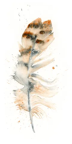
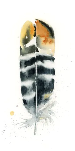
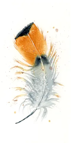
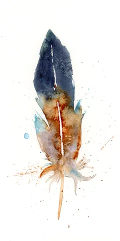
In this painting, I used my hand-made pigment, Rocky Mountain #7, to create a vivid contrast between fiery orange and calming gray. The brushstrokes flow like a gentle breeze, with… more→
Palette:
In this painting, I used soft grays and blues with delicate strokes to mimic the subtle beauty of a feather. Each layer is carefully blended to create a sense of… more→
Palette:
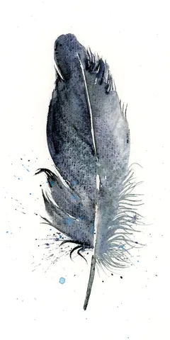
In this painting, I've embraced muted grays and soft blacks, allowing the delicate layers to create a sense of lightness and airiness. By using gentle brushstrokes and subtle splatters, I… more→
Palette:
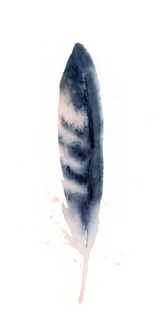
In this painting, I embraced the fluidity of watercolor to create a feather that feels both grounded and ethereal. The deep blues and warm browns blend seamlessly, with delicate transitions… more→
Palette:
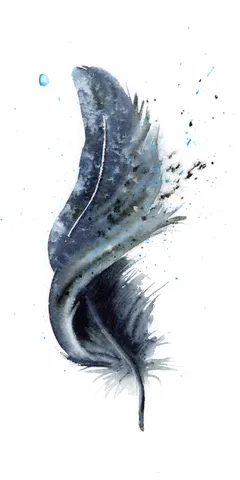
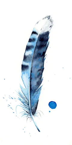
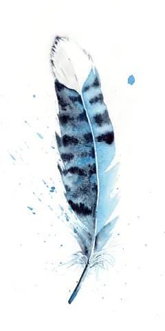
In this painting, I chose deep blues and soft grays to craft the feather’s delicate texture, contrasting with the crisp white background for emphasis. I used loose, flowing brushstrokes to… more→
Palette:
I chose to use a soft palette of deep indigos and gentle grays, letting the colors flow naturally with the brush as if they had a mind of their own.… more→
Palette:
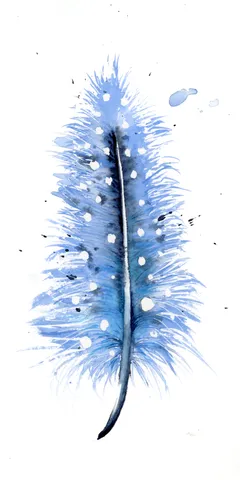
In this piece, I carefully used subtle grays and soft blues to create a feather that feels as though it's floating gently in mid-air. The delicate transitions and smooth layering… more→
Palette:
In my painting, I chose warm earth tones, allowing gentle browns and soft whites to engage with subtle hints of gray. The feather's central spine creates a natural divide, balancing… more→
Palette:
In this piece, I chose soft, earthy tones to bring a sense of calm and subtle beauty. The delicate watercolor transitions and soft blends mirror the lightness and grace of… more→
Palette:
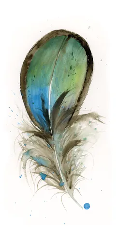
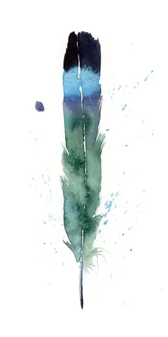
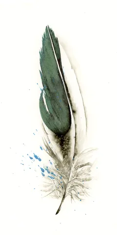
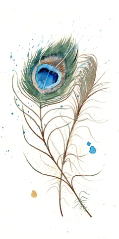
In creating this piece, I embraced a rich emerald green for the feather, allowing the color to deepen and flow into lighter shades at the edges, highlighting its graceful form.… more→
Palette:
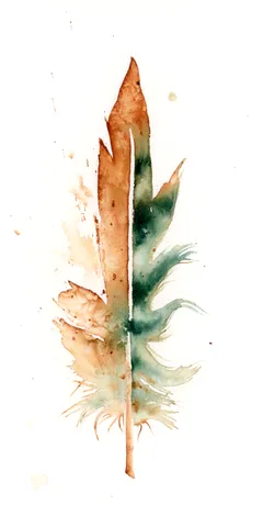
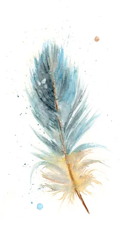
As I painted this feather, I chose warm earth tones and soft greens, allowing them to flow and merge gently. The watercolor technique lets the colors bleed into one another,… more→
Palette:
In painting this piece, I carefully chose deep greens and earthy browns to create a contrast that feels both calming and invigorating. The gentle transitions between these hues guide the… more→
Palette:
In this painting, I embraced the delicate interplay of muted grays and soft browns to create a feather that seems nearly weightless against the white background. The gentle splatters and… more→
Palette:
In creating this painting, I chose a monochromatic palette of soft blacks and grays, allowing the gentle transitions and delicate feather details to breathe. The subtle brushstrokes and careful layering… more→
Palette:
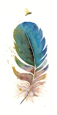
In creating this painting, I carefully chose deep blues and vibrant greens to flow seamlessly together, allowing their natural transitions to speak softly yet boldly. The gentle layering technique mixed… more→
Palette:
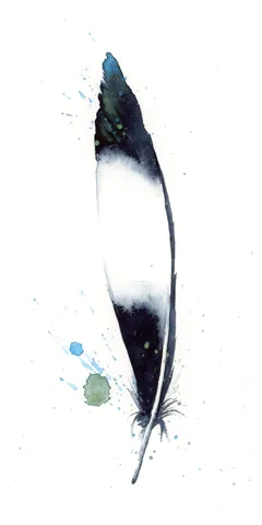
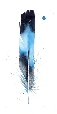
In this piece, I embraced the rich, deep blues transitioning elegantly into soft, snowy whites, embodying a sense of calm and focus. The feather's edges are meticulously defined, yet the… more→
Palette:
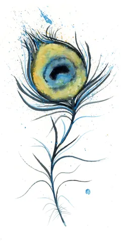
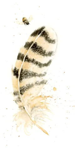
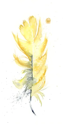
In this painting, I chose soft, gentle yellows with hints of gray to capture the delicate nature of the feather. I used light brushstrokes to create a sense of floatiness,… more→
Palette:
In this watercolor painting, I chose soft, muted shades of grey and beige, allowing the feather to gently emerge from the white space, creating a serene balance. The subtle transitions… more→
Palette:
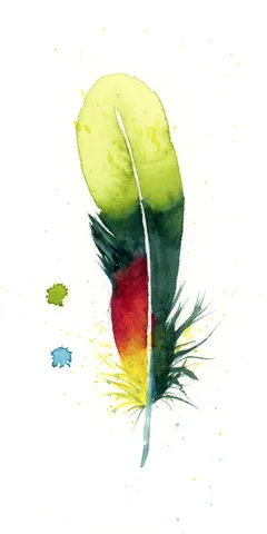
I chose vibrant greens, deep blues, and rich reds to breathe life into the feather, with colors blending smoothly into one another like nature's own transitions. The gentle flow of… more→
Palette:
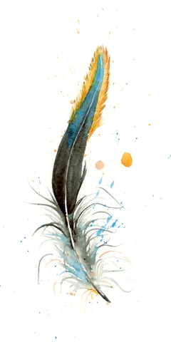
In this piece, I used a soft palette of blues and oranges to convey a sense of calm against a lively background. The feather's delicate brushstrokes give it a sense… more→
Palette:
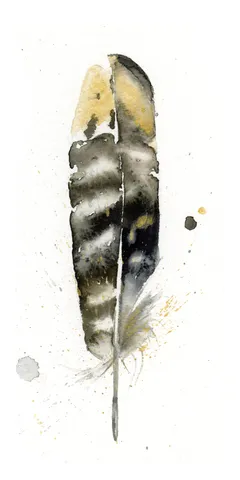
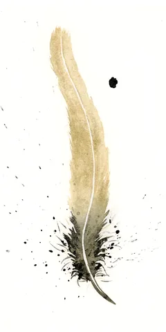
In this painting, I used the hand-made pigment Marshall Fire #1 to craft a feather that hovers softly on the canvas. The muted grays and subtle golds fade into each… more→
Palette:
In this piece, I brought the feather to life using soft transitions of charcoal blacks and warm earth tones created from my hand-made Marshall Fire #1 pigment. I used gentle… more→
Palette:
In this piece, I embraced earthy tones, with soft greys and rich golds created from my hand-made Marshall Fire #1 pigment. I used delicate brushstrokes and intentional splatters to convey… more→
Palette:
I carefully layered the earthy tones of handmade pigment Marshall Fire #1 to capture the soft intricacy of a single feather. The feather's dark spine contrasts with the softer edges… more→
Palette:
In this painting, I've used delicate shades of earthy browns and subtle greys to bring the feathers to life, crafting each hue with hand-made pigment Marshall Fire #1. The gentle… more→
Palette:
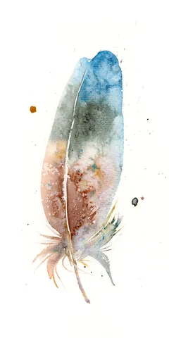
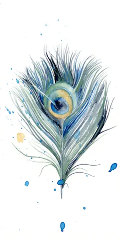
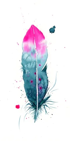
In this piece, I wanted to express a sense of serenity and assurance through the vibrant pink and teal hues delicately transitioning down the feather. I used gentle brushstrokes that… more→
Palette:
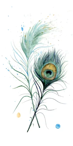
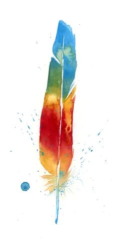
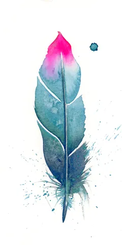
In this piece, I wanted to capture a sense of renewal and clarity using subtle, bold hues. The vibrant pink at the feather's tip transitions seamlessly into calming shades of… more→
Palette:
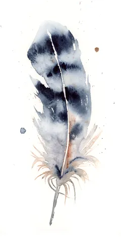
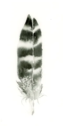
In creating this piece, I gently balanced shades of deep charcoal with light washes of muted gray, letting the ink flow naturally to mimic the grace of a feather. The… more→
Palette:
I chose the soft, earthy tones of my hand-made pigment, Marshall Fire #1, to create a feather that embodies strength and resilience. The gentle transitions from light to dark through… more→
Palette:
In creating this piece, I used the hand-made pigment Rocky Mountain #6 to bring rich, earthy tones to life. The feather's deep, gentle browns and warm whites melt seamlessly together,… more→
Palette:
I chose a subtle and earthy palette for this piece, including my hand-made pigment Rocky Mountain #6. The gentle transitions and delicate layers bring a softness to the feather, allowing… more→
Palette:
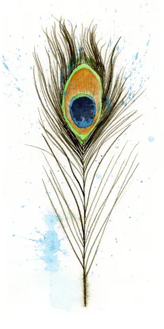
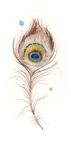
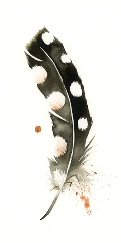
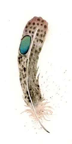
In this painting, I used a palette of soft browns and grays to capture the delicate nature of the feather, contrasted with a vibrant blue for the eye. The gentle… more→
Palette:
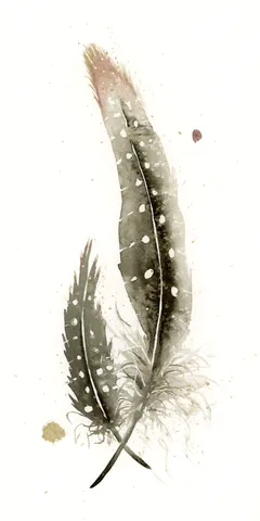
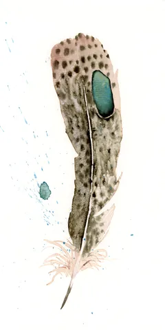
In this piece, I chose soft earthy tones blended with a vibrant teal accent to contrast the subtle speckled texture of the feather. The delicate transitions and loosely layered brushstrokes… more→
Palette:
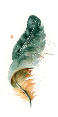
In this painting, I used a blend of deep blues and greens transitioning gracefully into soft browns, creating a feather that feels both delicate and strong. The splatters and drips… more→
Palette:
In this painting, I embraced the serenity found in simplicity, using handmade pigment Rocky Mountain #6 to create the soft blues that gracefully blend into the earthy tones of the… more→
Palette:
In creating this piece, I embraced the warm, earthy hues of the hand-made pigment Rocky Mountain #5. The soft transitions between the rich browns and delicate creams highlight the feather's… more→
Palette:
I wanted to capture a sense of calm and focus using the earthy hues of my hand-made pigment, Rocky Mountain #5. The feather’s soft, muted browns gently transition into lighter… more→
Palette:
In this painting, I used my hand-made pigment, Rocky Mountain #5, to create a delicate play of earthy tones and ethereal whites. The feather's subtle transitions and gentle splatters invite… more→
Palette:
I chose earthy, muted tones to bring this feather to life, using my hand-made pigment Rocky Mountain #6. The gentle transitions between the soft browns and deep blacks capture the… more→
Palette:
In painting this feather, I embraced the colors of nature by blending deep blues and warm brown tones, allowing them to softly transition into each other. My brushstrokes were gentle… more→
Palette: