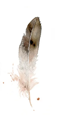
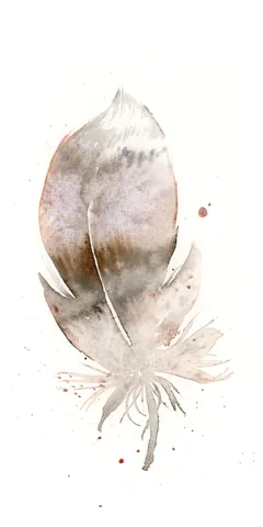
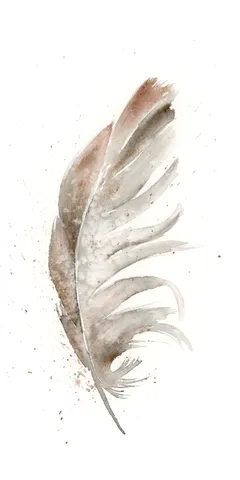
In this piece, I embraced the gentle hues of brown and soft blush to craft a feather that seems both delicate and grounded. The transitions between the darker and lighter… more→
Palette:
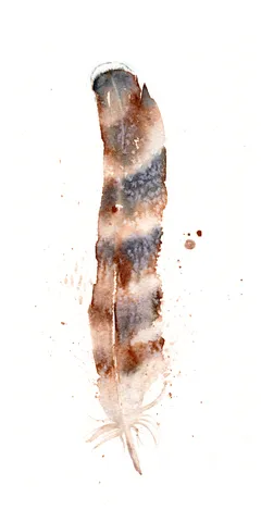
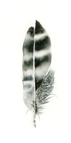
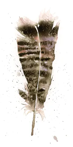
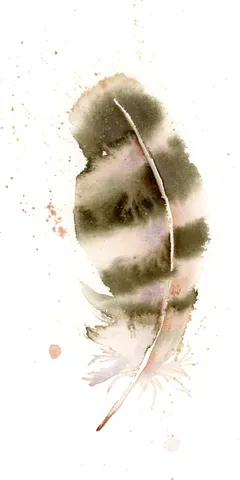
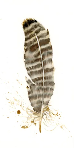
I chose warm, earthy browns and soft, muted grays to create a gentle yet striking presence on the canvas. The subtle blending and flowing transitions of watercolor evoke a sense… more→
Palette:
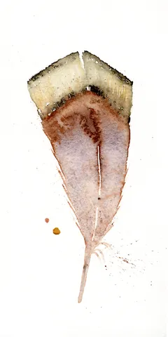
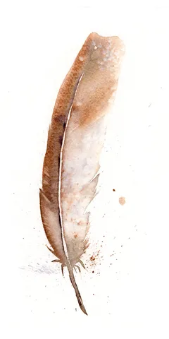
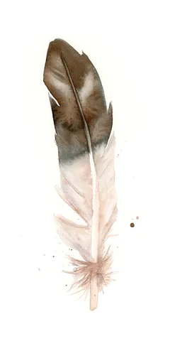
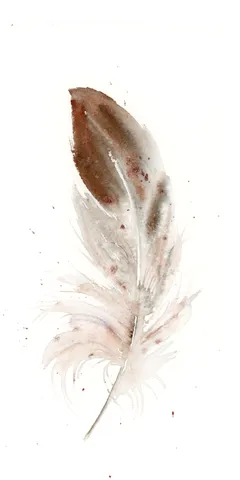
In this piece, I used gentle washes of sepia brown and soft pink to capture the simplicity and grace of a single feather. By layering subtle strokes and allowing the… more→
Palette:
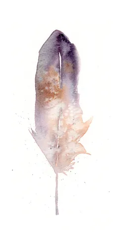
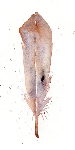
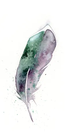
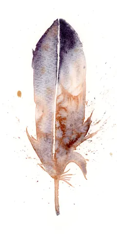
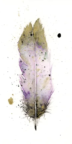
In this painting, I gently combined soft purples and earthy browns, allowing them to blend seamlessly, creating a gentle harmony that feels both grounding and uplifting. My brushstrokes were careful… more→
Palette:
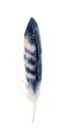
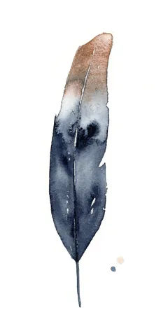
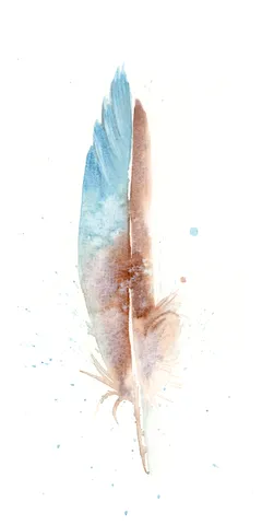
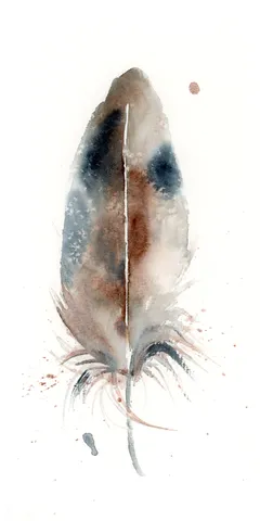
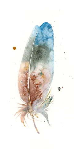
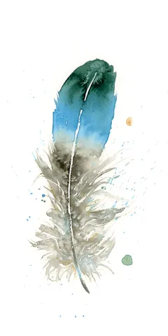
In this painting, I embraced the fluidity of watercolors, allowing deep purples and soft blues to blend with gentle transitions that move seamlessly. The top of the feather is dark… more→
Palette:
I chose a gentle palette of earthy browns and soft grays, blending them together to create fluid transitions and a sense of warmth. With deliberate brushstrokes and careful layering, I… more→
Palette:
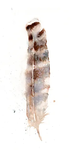
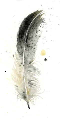
In this piece, I chose earthy browns and soft grays to create a gentle, flowing transition from the deep tones at the base to the softer shades at the tip.… more→
Palette:
In this painting, I used delicate shades of brown and soft grays to capture the essence of a feather, intentionally leaving the edges undefined for a gentle touch. The subtle… more→
Palette:
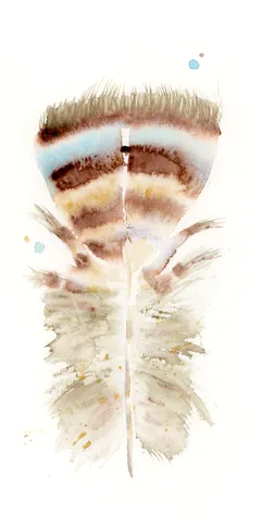
In this painting, I focused on using a warm, earthy palette with hand-made rock mountain pigment #7 to highlight the delicate beauty of a single feather. The gentle transitions and… more→
Palette:
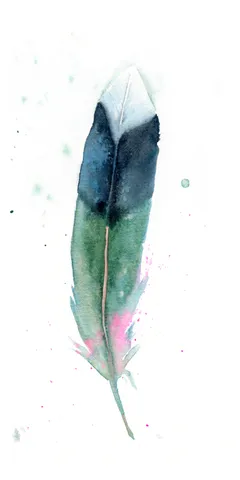
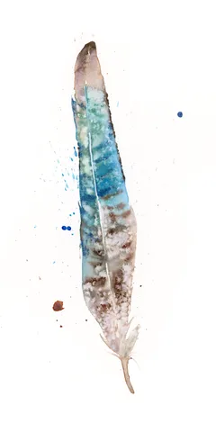
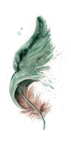
In this piece, I chose soft greens and purples, letting them blend gently into each other, creating a serene yet dynamic flow. The feather’s delicate edges and subtle splatters hint… more→
Palette:
I chose a gentle, earthy palette, infused with my hand-made Moab Pigment #1, to create this delicate feather. By layering soft purples and rusty browns, I allowed the colors to… more→
Palette:
In this piece, I used soft, earthy tones like gentle browns and subtle grays, allowing the feather to appear both delicate and grounded. The watercolor technique enables smooth transitions and… more→
Palette:
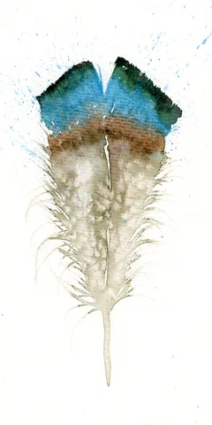
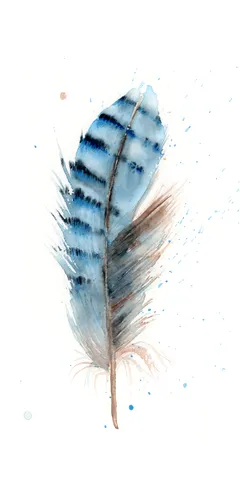
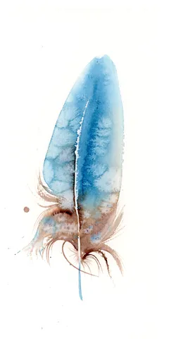
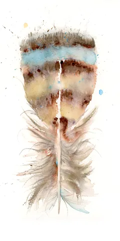
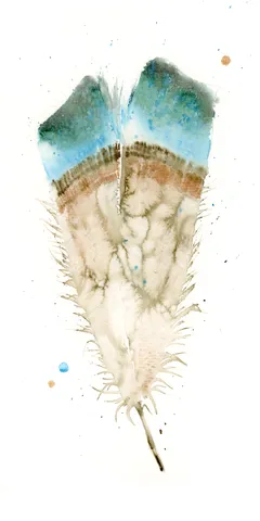
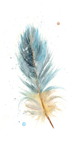
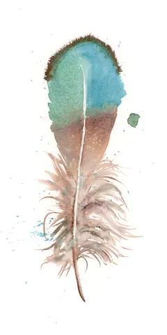
In this piece, I gently guided soft blues and earthy browns to create a feather that feels both delicate and grounded. The colors are layered with light brushstrokes that allow… more→
Palette:
In this piece, I embraced a gentle palette of soft blues and warm browns to create a sense of calm and connection. I allowed the colors to blend and bleed… more→
Palette:
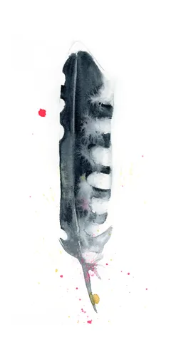
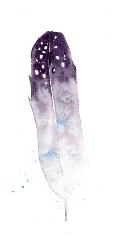
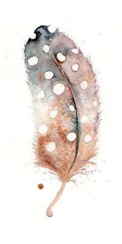
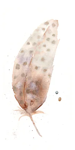
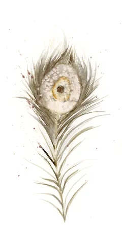
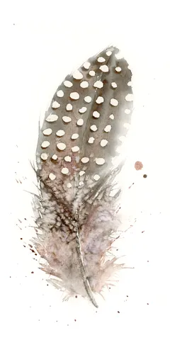
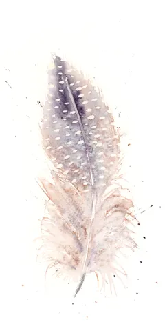
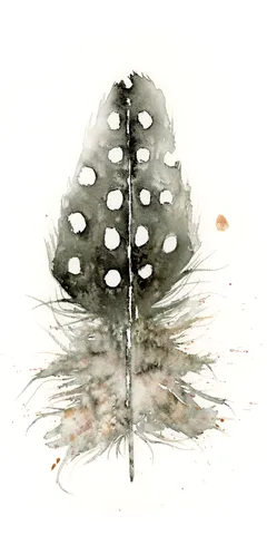
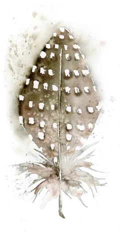
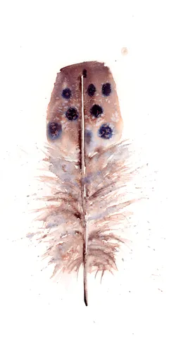
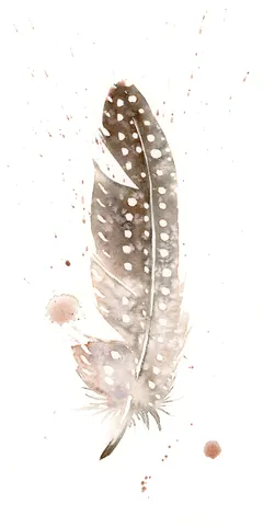
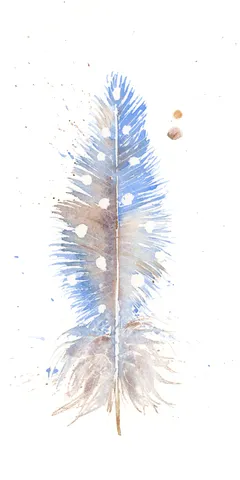
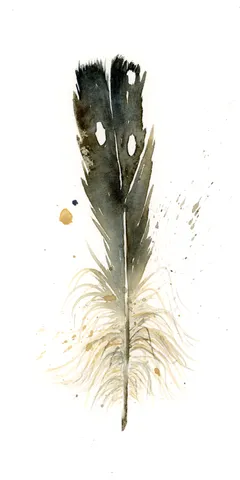
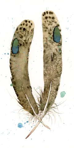
In painting this feather, I embraced the gentle yet striking mix of earthy browns and soft greys, punctuated by bold white spots. I applied the watercolor in fluid layers, allowing… more→
Palette:
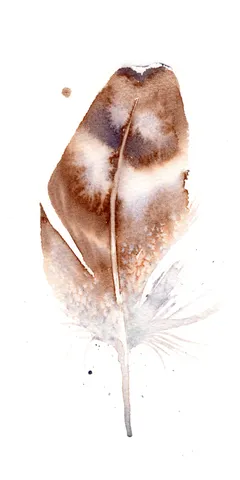
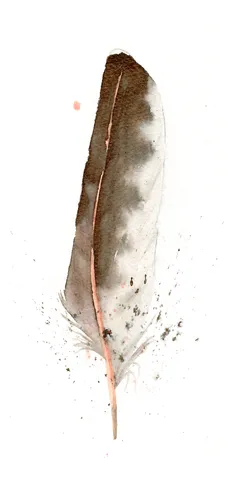
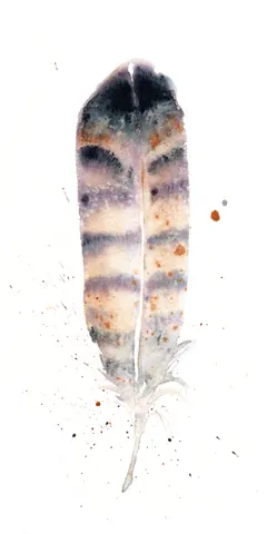
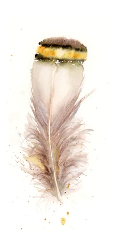
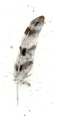
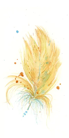
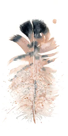
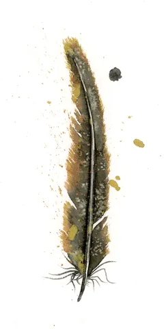
In this piece, I embraced a muted palette of soft browns, warm yellows, and deep blacks to capture the delicate essence of a feather. I focused on creating seamless transitions… more→
Palette:
In this painting, I used soft washes of sky blue and warm earth tones to create a delicate, uplifting scene. Gentle brushstrokes and subtle transitions evoke a sense of calm… more→
Palette:
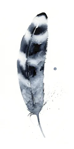
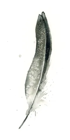
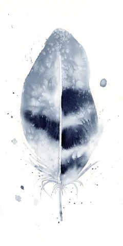
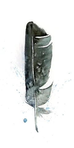
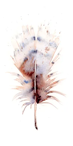
In this painting, I embraced the subtle beauty of grayscale, using soft transitions from light to dark to capture the delicate nature of the feather. I let the ink flow… more→
Palette:
In this piece, I used soft, earthy tones of brown and gray to give the feather a delicate, ethereal quality. The gentle transitions and subtle layering create a sense of… more→
Palette:
I chose a palette of soft grays and warm browns, allowing the feather's elegant simplicity to shine through gentle transitions and delicate layers. With each brushstroke, I aimed to capture… more→
Palette:
I chose soft, earthy tones, like gentle browns and deep blues, to create this feather, letting them blend gracefully. With each brushstroke, I aimed for subtle transitions, allowing the colors… more→
Palette:
In painting this feather, I chose earthy browns and soft grays to create a sense of warmth and familiarity. The gentle transitions between colors were achieved by layering watercolors delicately,… more→
Palette:
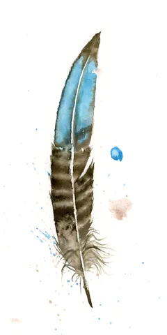
In this piece, I used my hand-made Rocky Mountain #7 pigment to create soft, earthy tones of blue and brown, capturing delicate transitions and subtle blends. I carefully layered my… more→
Palette:
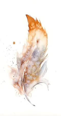
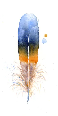
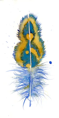
In this piece, I embraced soft, earthy hues crafted from my hand-made pigment, Rocky Mountain #7. The gentle blends of golden yellows and blues flow into each other, creating a… more→
Palette:
I brought this feather to life using the soft, earthy hues of my hand-made Rocky Mountain #7 pigment. I carefully layered gentle blues and browns, letting them blend into one… more→
Palette:
In this piece, I used the hand-made pigment Rocky Mountain #6 to create rich, earthy tones that flow softly from dark to light, capturing the delicate balance of nature. The… more→
Palette:
In this painting, I embraced the gentle, earthy tones of my hand-made pigment, Rocky Mountain #6, to create a feather that floats with an air of quiet elegance. The blend… more→
Palette:
In this painting, I used warm earth tones and cool grays, blending them seamlessly with soft brushstrokes that give the feather its ethereal quality. The subtle transitions and gentle splatters,… more→
Palette:
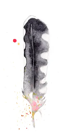
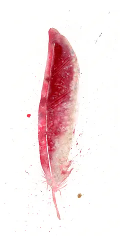
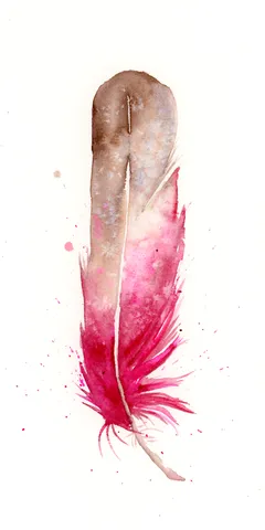
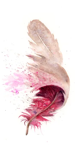
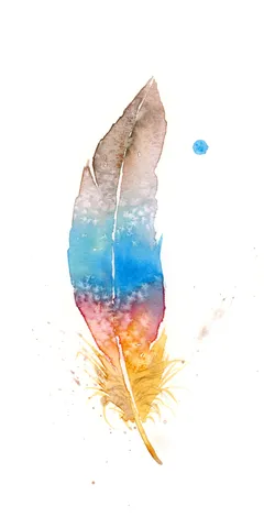
In this painting, I used a gentle gradient from earthy browns to vibrant pinks to capture a sense of transformation and inner strength. The soft transitions and delicate blends were… more→
Palette:
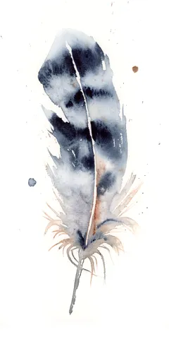
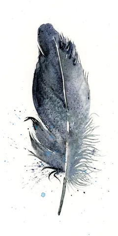
In this painting, I chose deep blues and soft grays to craft the feather’s delicate texture, contrasting with the crisp white background for emphasis. I used loose, flowing brushstrokes to… more→
Palette:
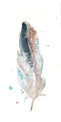
In this piece, I carefully used subtle grays and soft blues to create a feather that feels as though it's floating gently in mid-air. The delicate transitions and smooth layering… more→
Palette:
In my painting, I chose warm earth tones, allowing gentle browns and soft whites to engage with subtle hints of gray. The feather's central spine creates a natural divide, balancing… more→
Palette:
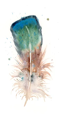
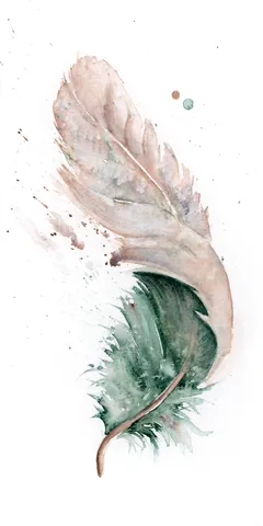
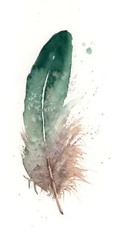
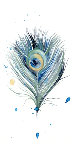
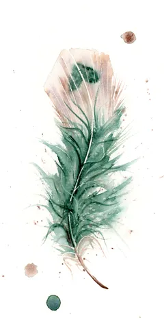
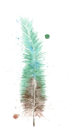
In creating this piece, I embraced a rich emerald green for the feather, allowing the color to deepen and flow into lighter shades at the edges, highlighting its graceful form.… more→
Palette:
I poured my heart into this piece, using a gentle blend of earthy browns and soft pinks to create depth and texture through subtle transitions and delicate layering. The feather's… more→
Palette:
In this piece, I chose soft blues and earthy browns to create a gentle interplay that feels both soothing and grounded. The watercolor transitions are smooth, yet purposeful, with edges… more→
Palette:
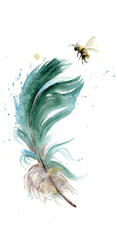
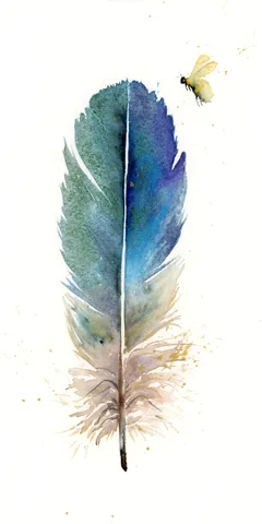
In this painting, I chose soft blues and warm browns to create a gentle transition between the calming feather and the lively bee. The watercolor technique allows for delicate blends… more→
Palette:
I chose soft browns and muted blues to bring a sense of calm and focus to the feather's form. The gentle transitions and layering of watercolor allowed me to play… more→
Palette:
In this painting, I chose soft, earthy browns and grays to create a sense of delicate balance and calm. I let the watercolor flow naturally, allowing the feather to emerge… more→
Palette:
Creating this painting, I chose a calming blend of handmade pigment, Rocky Mountain #6, to bring life to the feather's delicate blue and brown hues. With gentle brushstrokes, I layered… more→
Palette:
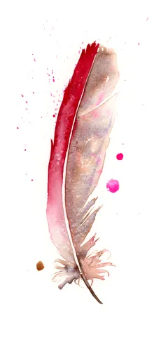
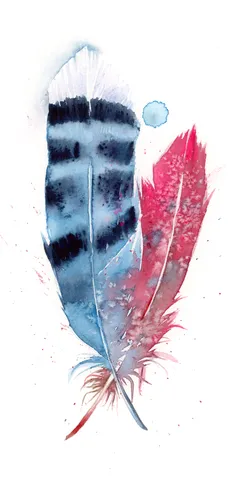
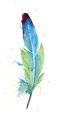
In creating this painting, I focused on the contrasting yet harmonious blend of vibrant red and calm blue, using watercolors with a soft touch to allow these colors to bleed… more→
Palette:
I painted this feather using a soft blend of earthy browns and gentle greens, letting the colors transition seamlessly from the robust base to the delicate tip. Each brushstroke was… more→
Palette:
In creating this piece, I focused on the delicate use of soft, earthy tones—gentle ochres and muted grays blend seamlessly, mimicking the natural elegance of a feather. The brushstrokes are… more→
Palette:
I chose to use a soft, gentle blue paired with earthy browns to create the feather in this piece, letting the hues merge and flow with delicate brushwork. The feathery… more→
Palette:
In this painting, I used the hand-made pigment Marshall Fire #1 to craft a feather that hovers softly on the canvas. The muted grays and subtle golds fade into each… more→
Palette:
In creating this piece, I focused on the gentle earth tones of browns and greens, bringing a naturally calming presence. The feathers rise with careful transitions from light to dark,… more→
Palette:
I carefully layered the earthy tones of handmade pigment Marshall Fire #1 to capture the soft intricacy of a single feather. The feather's dark spine contrasts with the softer edges… more→
Palette:
In crafting this piece, I carefully layered soft earth tones using my hand-made pigment, Vermont #1, to bring out the delicate details and gentle energy of the feather. The transitions… more→
Palette:
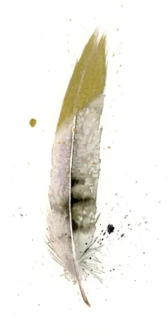
In this painting, I used handmade pigment Marshall Fire #1 to craft gentle transitions of gold and soft violet that drape across the feather's form. The light splatters and dynamic… more→
Palette:
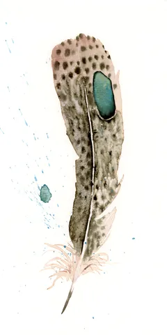
In this piece, I chose soft earthy tones blended with a vibrant teal accent to contrast the subtle speckled texture of the feather. The delicate transitions and loosely layered brushstrokes… more→
Palette:
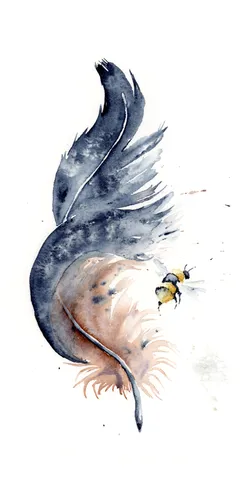
In creating this piece, I embraced the soothing blend of cool blues and warm browns to convey the delicate strength of the feather and the whimsical nature of the nearby… more→
Palette:
In painting this feather, I embraced the colors of nature by blending deep blues and warm brown tones, allowing them to softly transition into each other. My brushstrokes were gentle… more→
Palette: